Frontend Architecture Map: A User Journey-Driven Approach to Avoid Hype-Driven Development
The Frontend Architecture Map helps product teams make smart decisions about frontend technologies based on the user journey, avoiding trendy pitfalls. It maximizes the real value of web applications by providing a clear, overarching approach to frontend architecture.
I've developed a personal weakness for trendy caffeinated sugar drinks. You know, the ones that give you that quick boost of energy just when you need to power through a late-night coding session or rapidly develop a new feature or work on business idea 😎.
Above all, I often try new of these hyped or trendy sugar mate drinks. I like them.

For a while, these drinks were my preferred solution for getting things done, just as I often jumped on the latest hyped front-end technology that promised to revolutionize the way we develop web apps.
But just as too much caffeine and sugar can lead to a crash, relying on the latest front-end trends can lead to an unhealthy product dependencies that is hard to maintain, unstable, or simply ineffective in the long run.
At home, I’ve tried to keep things simpler and healthier. In my fridge there is only water — plain, unexciting, but reliable.
And although I sometimes miss the quick kick of a sugary drink, I appreciate the steady, consistent energy that water provides. This change in my personal habits reflects my new approach to front-end development.
Instead of chasing every new tech trend, I’ve learned the importance of using these technologies carefully and purposefully, just as I save the sugary drinks for the moments when I really need them.
This is where the Frontend Architecture Map comes into play. It’s the balanced, measured approach that your development process needs — just like you drink water most of the time, but know when to reach for an energy drink.
This map will help you navigate the complex landscape of front-end development by guiding you to make user journey driven and thoughtful architecture and technology decisions that avoid the crashes associated with hype while taking advantage of new technologies where they offer real value.
What is the Frontend Architecture Map?
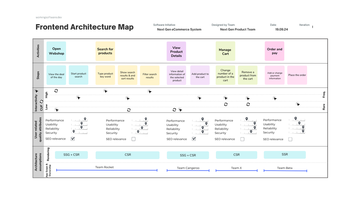
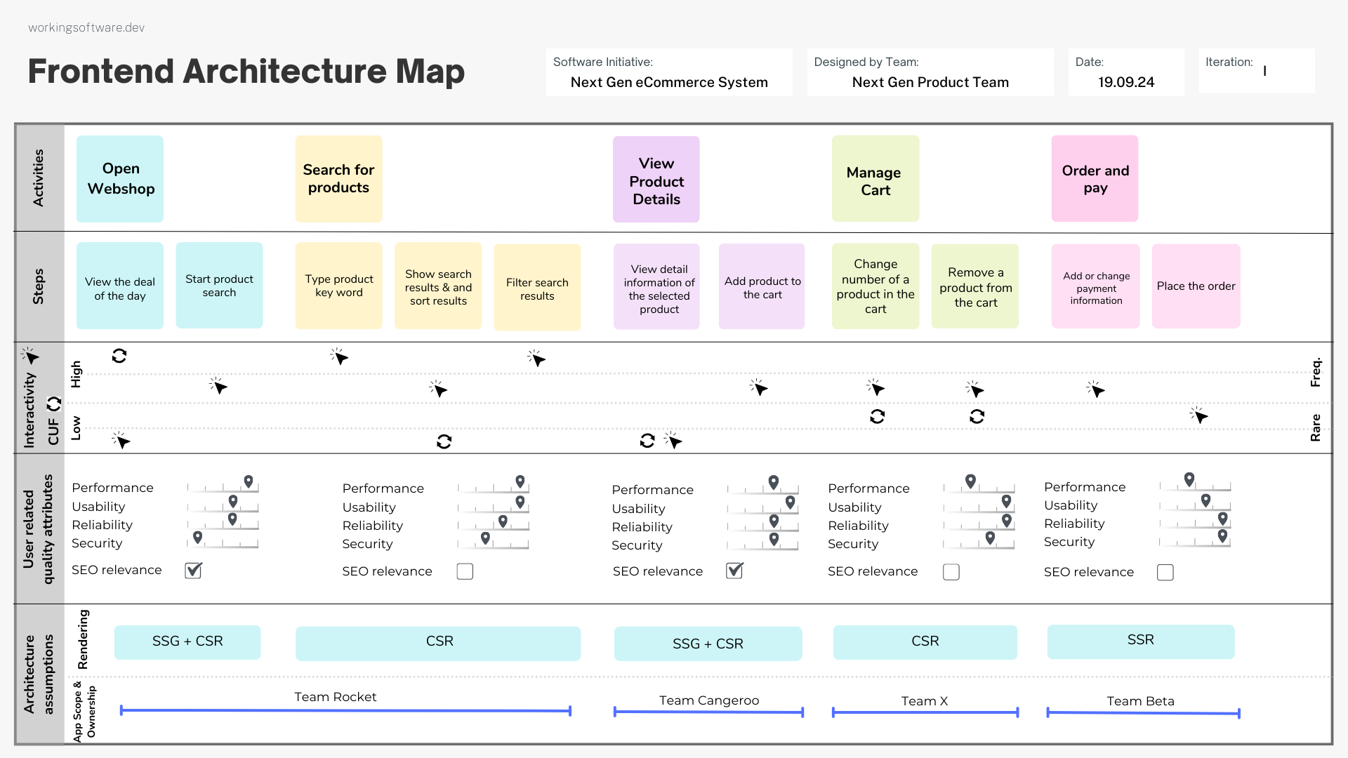
The Frontend Architecture Map is a powerful collaboration technique that maps the user journey while integrating key architectural considerations for next-generation web applications. It is ideal for cross-functional product teams and ensures the development of robust and user-friendly web applications.
Rather than adopting the latest framework just because it’s popular, the map encourages you to think about how users interact with your web application and what they actually need at each point.
The Frontend Architecture Map helps you figure out when it’s worth using these technologies to improve user experience or performance and ensures they are used thoughtfully and not indiscriminately.
The Parts of the Frontend Architecture Map
The Frontend Architecture Map is divided into several key layers, each focusing on different aspects of user interaction and technical requirements:
User Activities and Steps
At the top of the map outlines the main activities that a user can perform, such as opening a web shop and browsing products. Activities and steps are the first parts of a User Story Map. It can be the result of a typical user story mapping workshop.
These activities are further broken down into specific steps, e.g. entering search terms or adding an item to the shopping cart. This detailed breakdown helps teams understand the stages of the user journey and recognise where each action fits into the overall experience.

Interactivity and Content Update Frequency (CUF)
Interactivity and the frequency of content updates determine the front-end architecture. Different rendering techniques support the interactivity and timeliness of content in different ways. Therefore, it is important to evaluate the interactivity and frequency of content updates for each user activity or step during the user journey.
Interactivity
This section assesses the level of interactivity required for each user activity. If you know the level of interactivity, you can decide which parts of the application need to be particularly responsive.
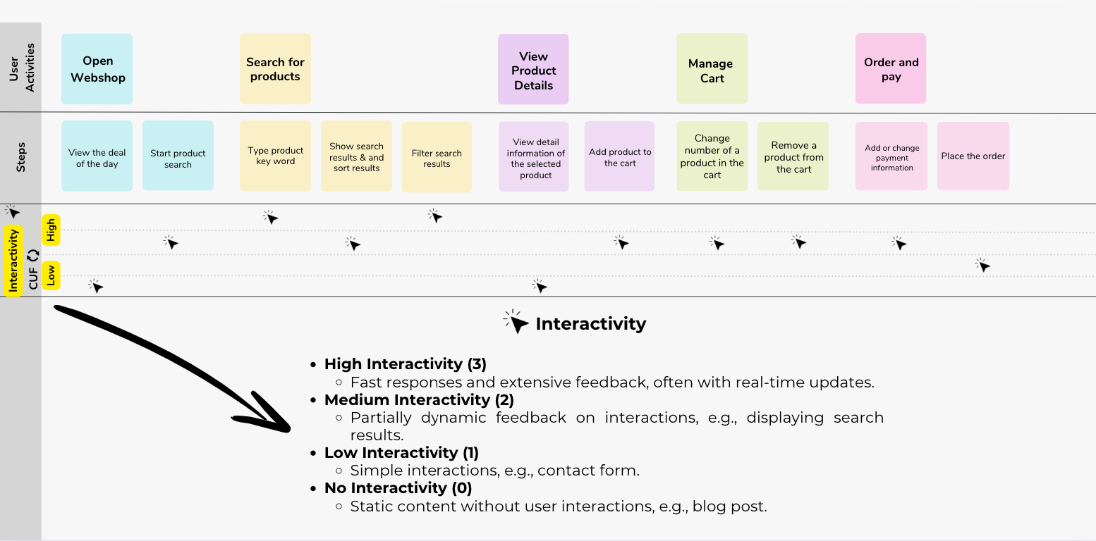
In this part, you rate the degree of interactivity of the respective user activity in the user story map:
- High Interactivity (3)
Fast responses and extensive feedback, often with real-time updates. - Medium Interactivity (2)
Partially dynamic feedback on interactions, e.g., displaying search results. - Low Interactivity (1)
Simple interactions, e.g. a contact form. - No Interactivity (0)
Static content without user interactions, e.g., blog post.
Content Update Frequency (CUF)
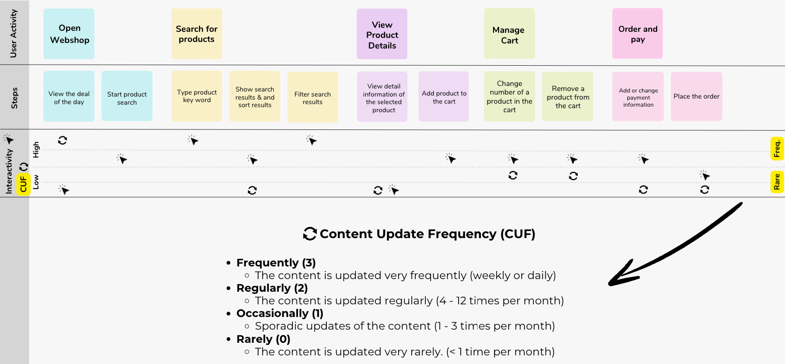
Content update frequency refers to how often information on a website or platform is updated or revised. This can range from real-time updates such as news or stock quotes to regular updates on a specific schedule (daily, weekly, monthly). The frequency depends on the type of content and the needs of the audience and ensures relevance and accuracy.
In this part, for each step of a user activity, you evaluate the update frequency of the related content, if possible.
User-Centric Quality Attributes and the assumed expectations
The map also evaluates various quality attributes — such as performance, usability, reliability and security — for each step in the user journey. By focusing on these attributes, you can ensure that your architecture supports the specific needs of users while making targeted decisions about when and where to deploy new technologies.
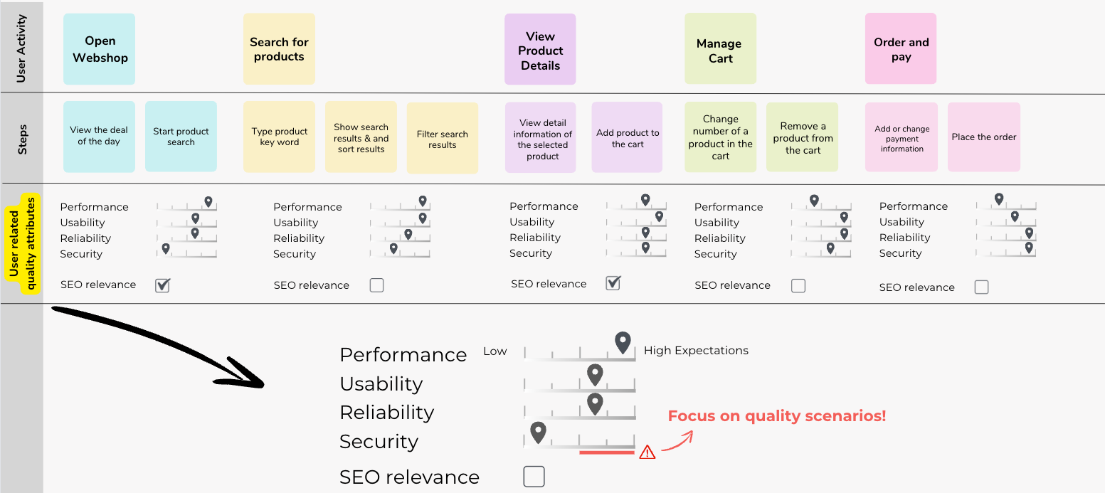
Try to evaluate the expectations for each of the user-related quality attributes. Is there a (very) high expectation or rather a low expectation?
If the (assumed) expectation is rather high, I recommend that you concretize this high expectation and translate it into concrete quality scenarios.

First architectural assumptions and organisational ownership
Finally, you are ready to create your first architectural assumptions for your "next gen" web frontend.
Architecture assumptions
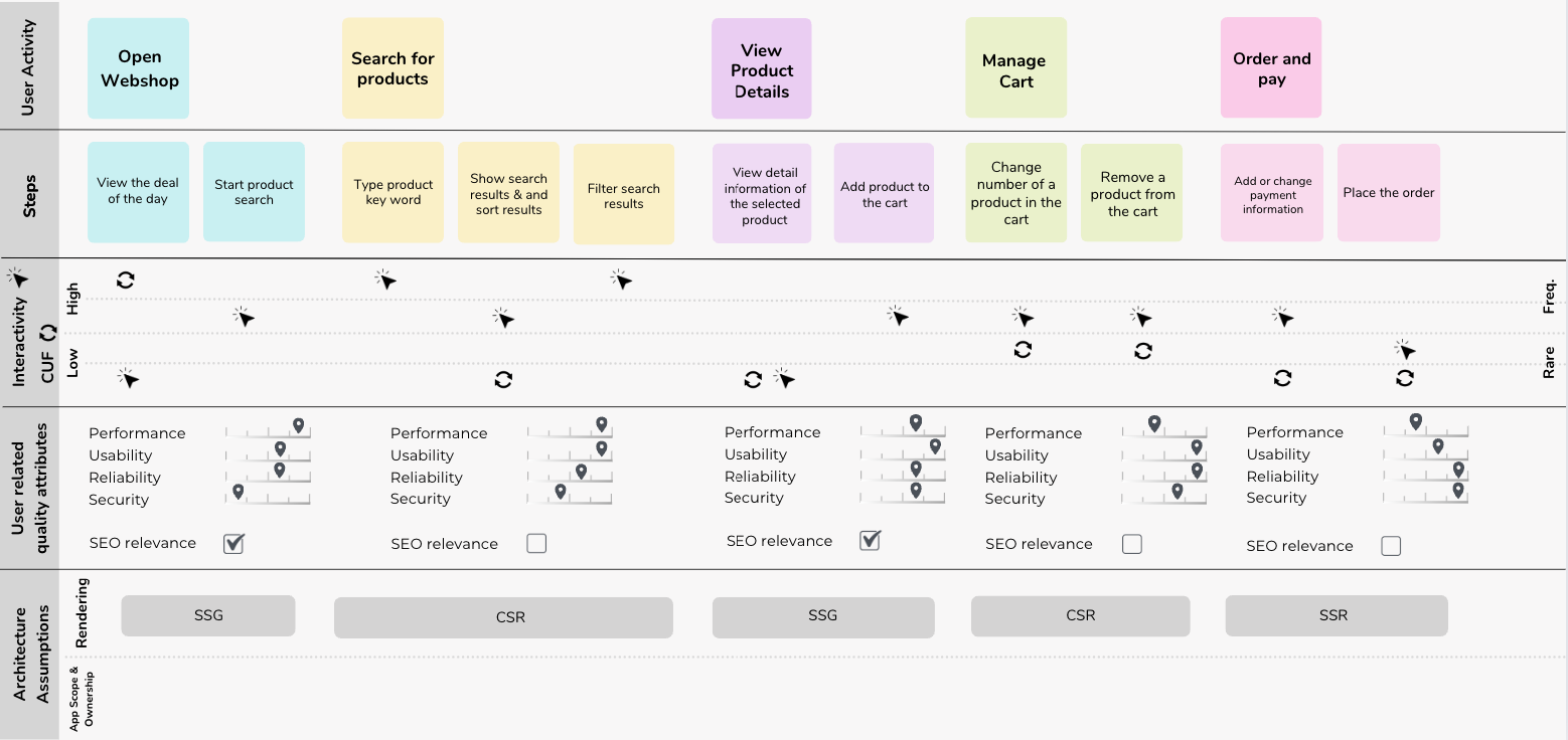
The rendering technique will shape your entire software architecture. So choose the right rendering technique for each user activity carefully.
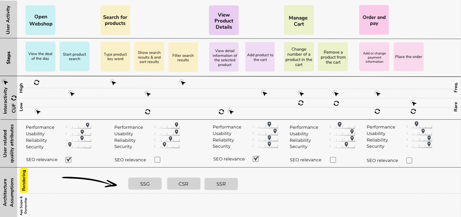
The frontend architecture map shows the architectural assumptions and the most appropriate rendering techniques (e.g. static rendering, client-side rendering or server-side rendering, or a combination of these) for each user activity.
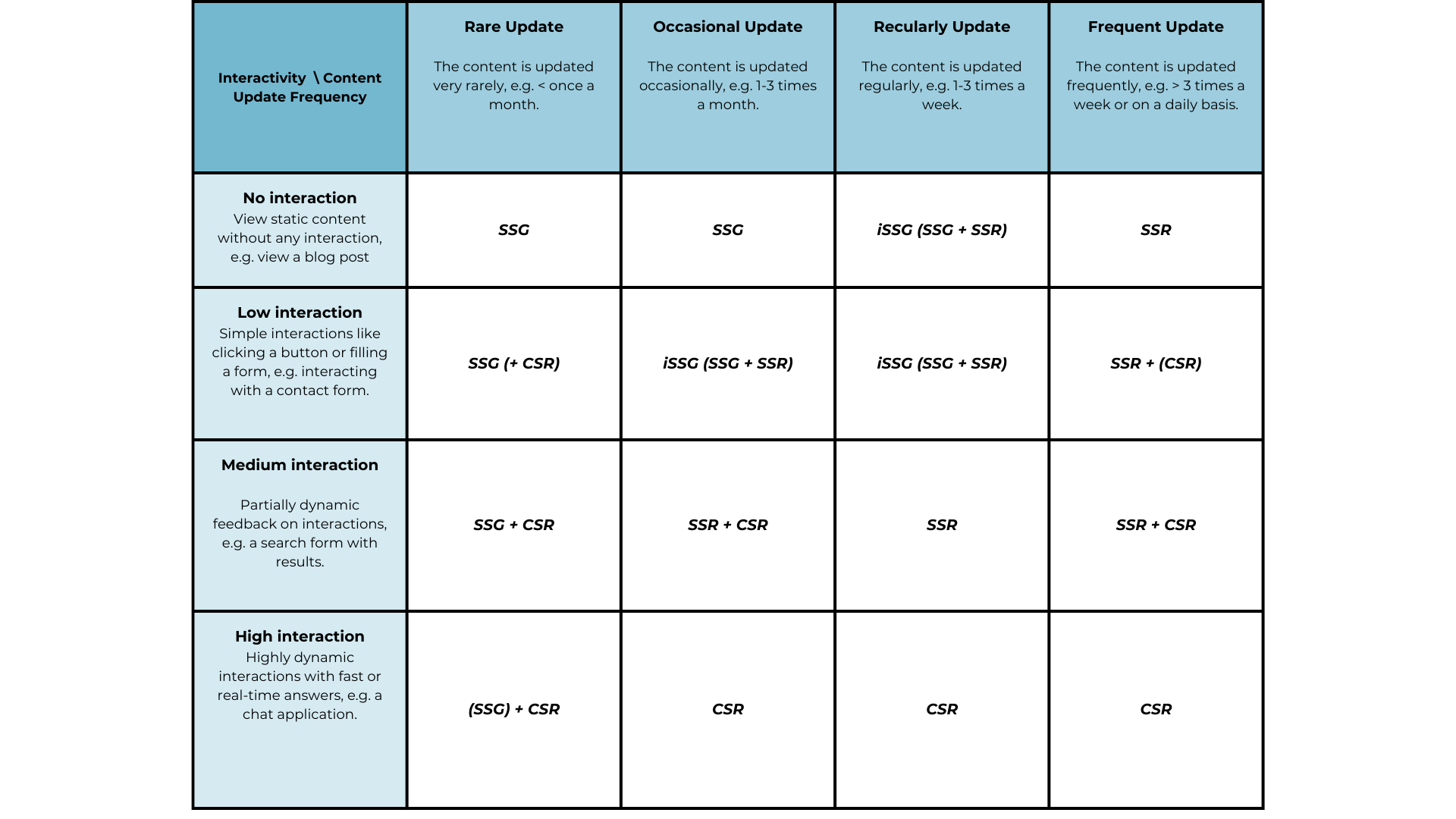
The following table is probably a guide for the optimal choice of rendering technique (Kudos to Natalia Venditto, she inspired me on their microfrontend.dev site) :
Organisational Ownership
Your organisation influences the architecture. And the architecture influences the organisation. That is Conway's law.
That's why it's important that you try to guess the scope and its organisational ownership. With the scope, you get the requirements for the specific front-end framework.
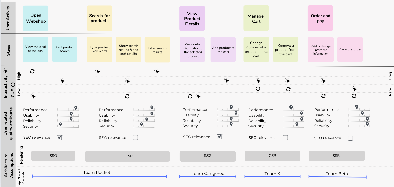
Now you have the most important requirements for selecting the technology for each app or building block.
Start with the technology selection
Now we open our technology box.

How to deal with the frontend framework long-list?
Unfortunately (or fortunately? :-) there are so many frontend frameworks. To make a pre-selection of frontend frameworks, I recommend you keep a (frontend) technology radar.
The technology radar helps you to monitor technology hypes and manage the technology lifecycle.
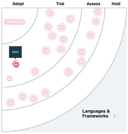
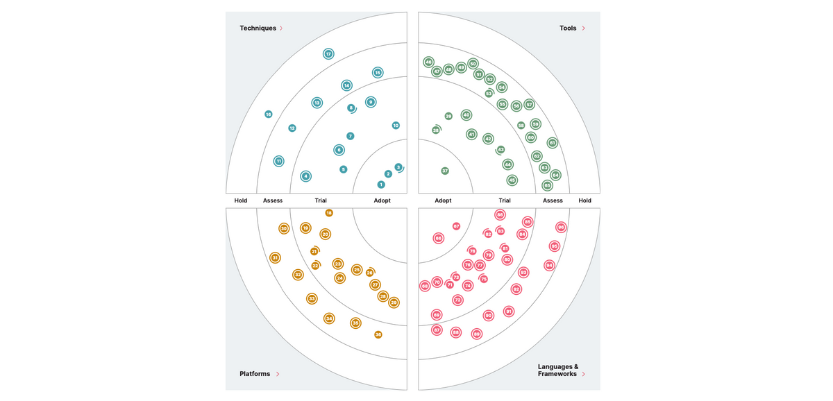
With the technology radar, you can turn potential front end technology from a long list into a short list.
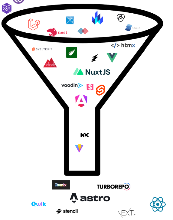
How to assess the technology in the short list?
Based on your company or team-wide technology radar, you have a short list of your frontend technology candidates.
Using the elaborated technology requirements on the frontend architecture map, you can now evaluate the individual frontend technologies on the short list.
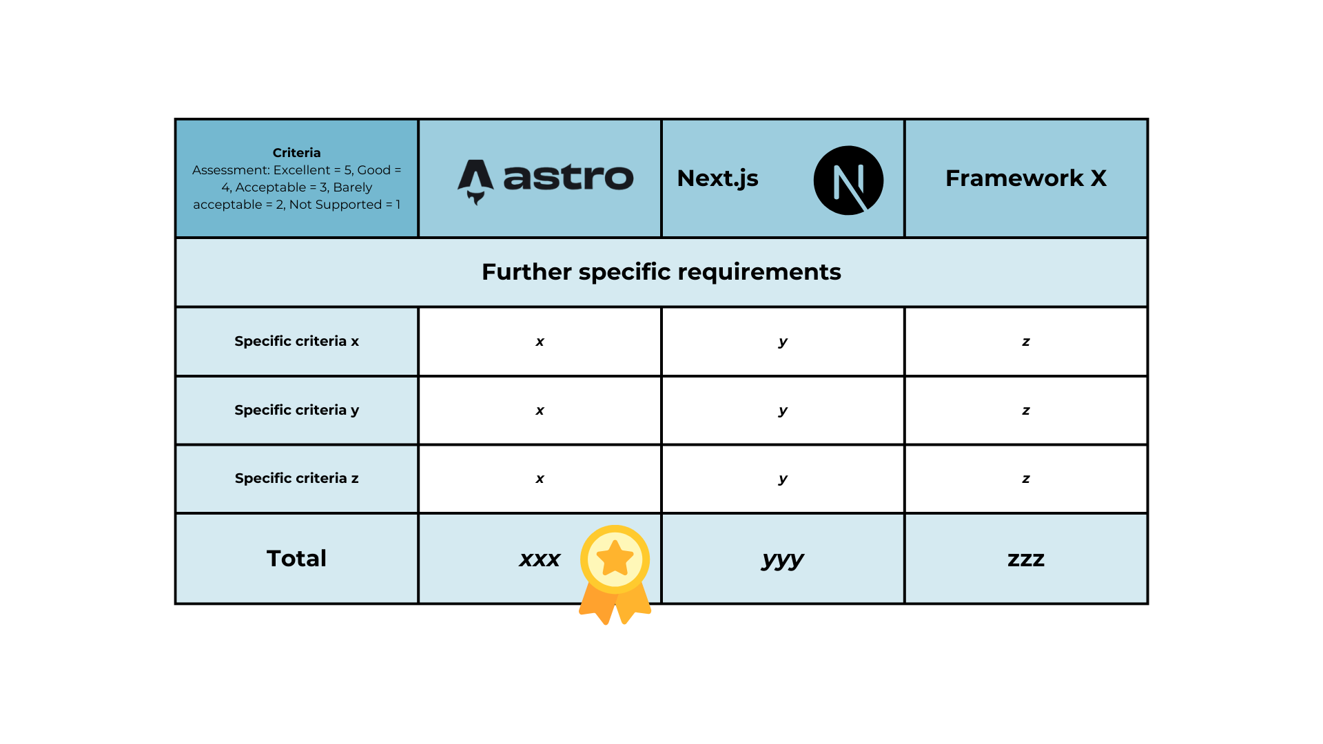
A good method for evaluating your frontend technology is the frontend framework decision matrix.
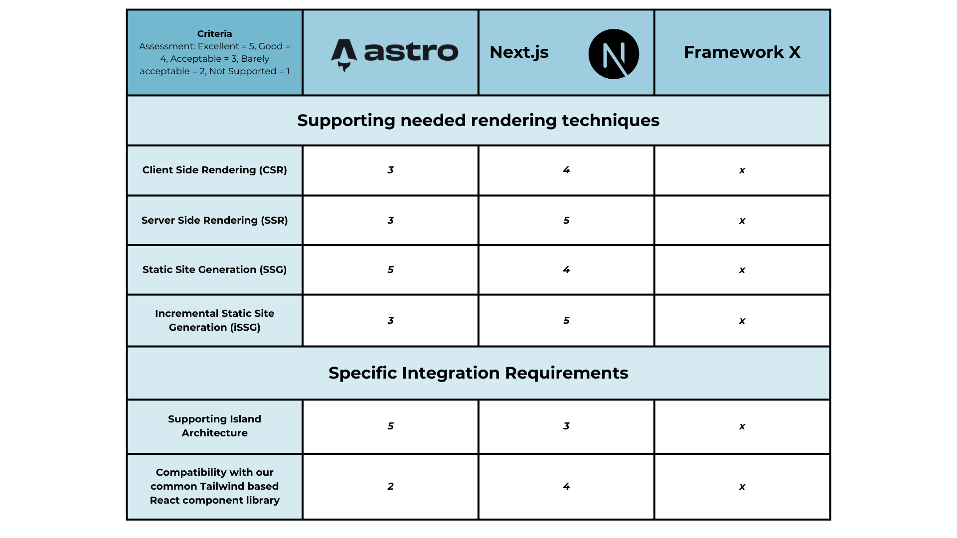
In the frontend decision, you add all the requirements that you have identified (via the frontend architecture map).
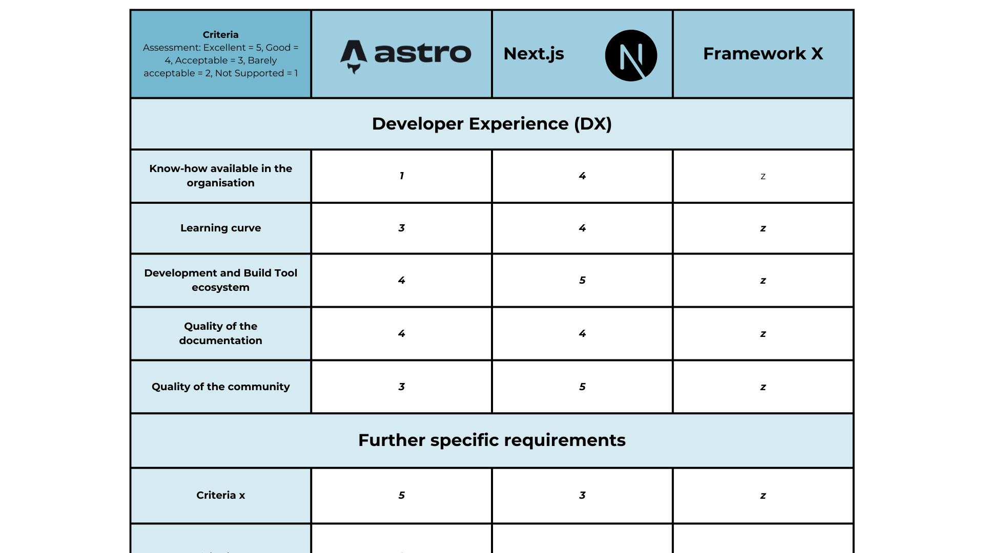
The frontend framework decision matrix helps you to decide which technology is suitable for your next frontend app or your next frontend component.
Tools
The frontend architecture map is currently available in various formats.
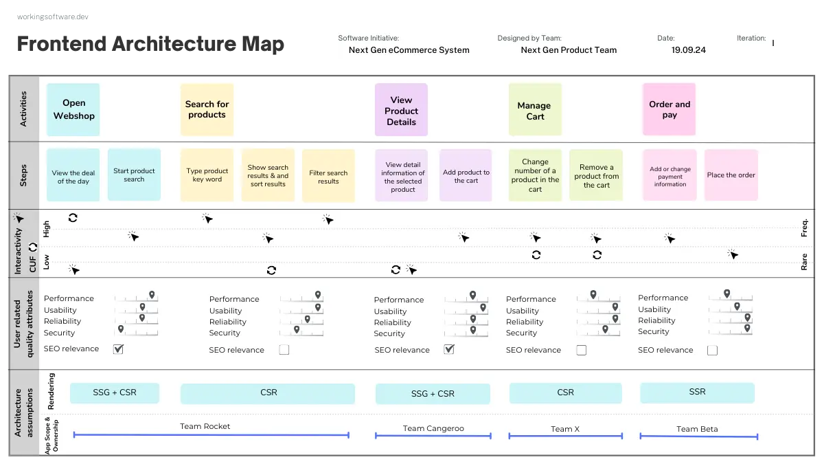
Any other representation (PNG, PDF, ...) can be found in the GitHub repository.
Feedback
The frontend architecture map is fairly new. I'm looking forward to your feedback. Please get in touch with me. You can find all my contact details here:




Comments ()